The Statistical Fallow Field
Imagine a field of fallow grass that has been left for a few years. The grass has grown a roughly equal length everywhere. The field slopes from one corner to the corner diagonally opposite, except at the bottom, where it flattens out, forming a level triangle. On the slopping part there are some deviations from a completely smooth plane. There are some ridges, troughs and mounds, most of them closer to the bottom of the field. Theoretically the undulations could be just the unequal growth of the grass, but it is more likely that it represents the profile of the ground itself, even though it can’t be observed directly.
Standing in the top corner there are five people, looking down over the field. Three of these people are scientists: A geologist, an archaeologist, and a palaeontologist. The geologist studies the inanimate earth and how it changes over time. The archaeologist studies the history of human activity through archaeological evidence, and the palaeontologist studies the fossil record.
These three people see something interesting in front of them. The geologist thinks that the flat part of the field marks the boundary of an ancient seashore when sea levels were much higher. The archaeologist thinks that a there may be evidence of a burial mound and maybe the outline of a building. The palaeontologist reckons that the seashore is from the Jurassic period and may harbour prehistoric marine fossils. The fifth person just sees a sea of grass.
The fourth person is me. I’m somewhere in between the disinterested person and the professionals. I’m fascinated enough to realise that there are probably hidden insights into the past under all this grass, even if I don’t have the expertise to extract them.
A lot of knowledge is like this. Hidden. First the potential for knowledge has to be recognised and second it has to be dug out. In the case of the fallow field the knowledge has to be literally dug out, but in most other areas of knowledge the digging is metaphorical.
And this, ladies and gentlemen, is why I love statistical analysis. Here’s an example:
The Office of National Statistics (ONS) is the current manifestation of a government agency that has been collecting socio-economic data about the UK since 1941, when Churchill asked for it to be set up during the Second World War. The breadth of data it has collected is astonishing, covering agriculture, environment, business, energy, children, education and skills, crime and justice, health and social care, the labour market, people and places, population, travel and transport.
All of this information is freely available on its website for anyone to download and analyse. The data is attached to geographical areas at many different scales from regions and local authorities to parliamentary constituencies and Super Output Areas (SOA). SOAs are areas that contain around 600 households with about 1500 people. There are 38,244 covering the whole of England.
Some of these spread sheets of data are enormous, and really are a sea of numbers, and it’s likely that’s what most people will see. But they’re not a sea of numbers to me or to anyone with an interest in the social sciences or motivated to find solutions to social problems. We both see the potential for insights. There are hidden depths just like the field of grass, and all we have to do is winkle them out. When numbers cohabit with lots of other numbers they hold secrets that beg to be unlocked. Here are some examples of the sort of knowledge that can be extracted from all this accumulated data held by the ONS.
Target resources where they are most needed
I once had the opportunity to do this when a Community Foundation in the North East of England commissioned me to do some analysis. Community Foundations draw together disparate and usually small pots of money, like trust funds, creating a much larger pot that community groups can bid into by a single process, The individual trusts have very different criteria and the Foundation works to bring bidders and the appropriate funds together. They have become so good at the dispersal of funds to the right places that Parliament has often given them the job of managing much larger government pots of money on their behalf.
But how can the Foundation be confident that the money is being directed to where it is most needed? Socio-economic data like that held by the ONS make it possible to home in on where the greatest need is for things like high levels of crime, unemployment and poor health.
There is however a school of thought that regards this kind of targeting as unhelpful. It’s called the prevention paradox and is sufficiently fascinating to warrant it’s own article.
Track changes over time
Because the socio-economic data has been collected for so long, it is possible to see how a location’s general health and wellbeing has changed over time and intervene before deprivation has become critical. This approach also has the potential to identify what causes the observed changes. One way to do this is to plot changes against say, significant changes to government policy. This is particularly relevant to the years of austerity since 2010 when increases in homelessness, poverty and food banks occurred.
Identify Cause and Effect
If you wanted to look into, lets say, poor health, there is a wide choice of data to study, from diet and exercise to life expectancy and the incidence of a wide range of diseases. However, other things like poverty, unemployment, and education may have an impact on the levels of health in any given area.
Just as data on the large number of variables in weather systems can be used to try and predict the weather by identifying cause and effect relationships, so socio-economic data has the potential to do the same for the general health and wellbeing of communities. It is not clear whether anybody is attempting this, but if they are, successfully identifying causes has so far eluded them.
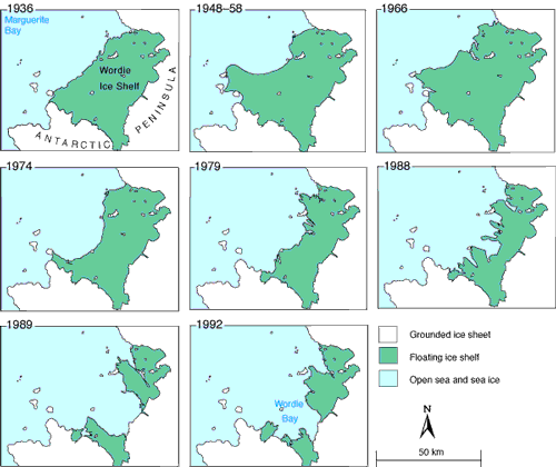
An example of retreating ice in Antarctica’s Wordie Ice Shelf. Source - Wikimedia, United State Geological Survey
Don’t stop collecting data: you never know when it is going to be useful
One way data can be unexpectedly useful is if it is collected for one purpose, but further down the line proves handy for something completely different.
William de la Mare is a researcher for the Australian Department for the Environment and was studying the retreat of sea ice around Antarctica. He wanted to measure the rate of retreat over a longer period of time than the available data would allow. This was because the first satellites capable of mapping the retreat weren’t launched until 1973. His solution was a lovely example of lateral thinking. It turns out that before satellites, the only records kept in the area were by whaling ships. They knew that the best place to catch whales was near the edge of the ice sheet. When they recorded the positions of their catch they were also recording the edge of the ice. De la Mare obtained these records from Norway’s Whaling Commission and was able to show that the ice had retreated by 25% between the 1950s and 1970s.
This is a great advertisement for never throwing anything away.